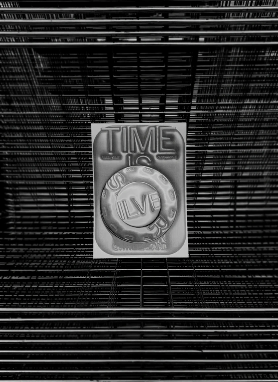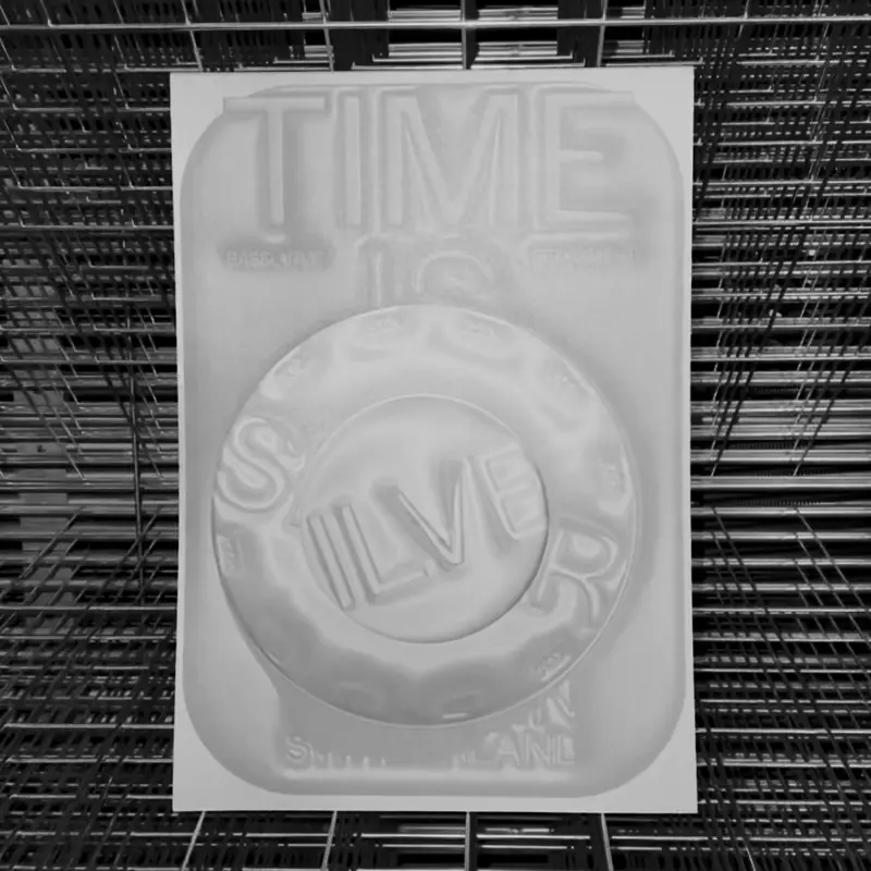


TIME IS SILVER
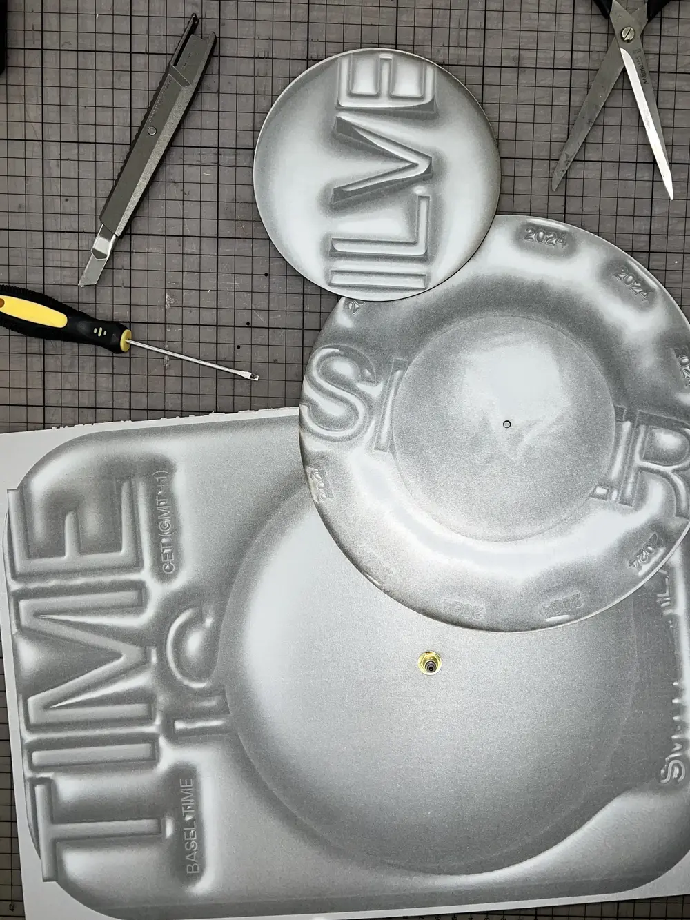
This poster is a clock. Two hidden analog movements drive circular plates behind the print, so the composition slowly turns in real time—hours and minutes sweeping across the surface without a screen. It grew out of my interest in motion graphics and the question: how can movement live in an analog, wall-mounted medium? The silver, airbrushed relief effect gives the piece a tin-cast, tool-made feel; light hits it differently throughout the day, so the poster looks “alive” even when you’re not watching.
Why “silver,” not gold? Silver is reflective and honest. It records time visibly—tarnishing, scuffing, catching fingerprints—so the material itself becomes a clock. It’s also the everyday metal of tools, cutlery, watch cases and street hardware: accessible, industrial, and unglamorous. Choosing silver rejects the “gold standard” of perfection and prize-winning speed; it values use, patina, and lived time.
Screenless motion, readable time, and a surface that shows its hours—Time Is Silver turns a poster into a quiet instrument for measuring the day.
$ 50Please contact me to purchase!